The title sounds harmless but I really need to say something here. It is well known that setting type on webpages isn’t really what typophiles are dreaming of. You can set basic things like the line height, the word spacing and you can align your text. Of course there are some more CSS properties but non of them are comparable to the ones that layout software like Quark or Indesign offers. Until CSS3 hits the surface we all gonna have to live with that. There is only one thing that needs to be changed and which can be changed pretty easily. What I’m talking about is »Justified Text on Webpages« and I tell you why I think it needs to be banned from the web.
You all know justified text from your newspapers. All the columns have the same width and if you squint at it it looks like a pattern made out of rectangles. In print it is commonly used because in layout software like Indesign you have a lot of options to modify the justification of the text. You have glyphscaling, letterspacing, wordspacing. You can decide whether if it should be fully justified or if ending of the last line of a paragraph is flexible. Then there is the baseline grid and various other things. Of course choosing a well behaving font is also possibile. All these things aren’t available on the web but all of them are very important to avoid ugly spaces or gaps between the words. For those who come up now with »But there is letterspacing in CSS2!«. It is true but if you put in, lets say 1em of letterspacing it will apply it on every letter. Usually you can define the maximum, the ideal and the minimum value of letterspacing which is allowed to be used in order to »form« the justified textblock – just like this:
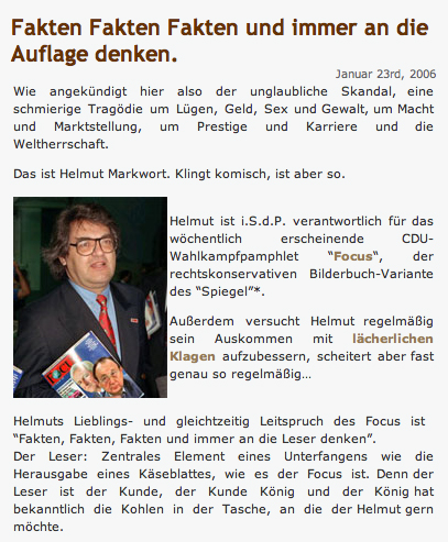
I will now give you three examples for bad behaving justified text to give you a visual impression. The first one is quite popular, its the website »we-make-money-not-art.com« which I really admire for its content rather than for its typography. Régine doesn’t write that much to each post which makes the whole thing bearable but things like this happen there as well (click on the pictures to get the fullsize version):

Most of you will ask »What’s the problem with that?« and I will respond: »Well, as I said, it is bearable!«
But there are other, more obvious, examples. In fact it is a common disease of the default wordpress theme which is called »Kubrick«. Every new installation of wordpress has justified text – have a look:
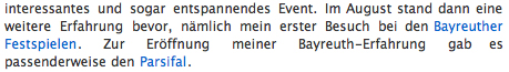
Alright, I kept the worst of the worst for the end of this little demonstration. The next site is another failure in attempting to rebuild the layout of a print news magazine on a webpage. It is just sad:
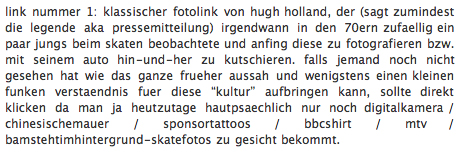
This guys blog is not the ugliest webpage, it is pretty neat, except for the text. Justified text comes really handy if you do multicolumn textblocks but even there it isn’t necessary as long as the margin between the columns is wide enough. But to be fair, most of the websites, and ALL of the mayor ones, use left aligned textblocks. The ones which do use the justified text are mostly individual driven pages or weblogs.
If you are still not convinced, let me give you the resumé:
Justified text on webpages …
- … can produce large and ugly gaps between the words
- … is almost impossible to handle it if you have very narrow textblocks
- … is not needed, not for efficiency purposes nor for aesthetics
- … uses up more space, quite the opposite of what it does in print publications
- … makes it hard to find the next line or follow the lines
- … behaves also bad because the default webfonts aren’t behaving nice in justified text
- … is just not pleasant to read!
On the other side
Left-aligned text on webpages …
- … is almost no trouble to use
- … you can finetune it with all the basic textformatting features of CSS2
- … it behaves better when it should float around pictures
- … is using the metrics for letterspacing which are included in the default webfonts
- … can also be used in multicolumn textblocks
- … behaves well in very narrow textblocks and short textlines as well in the wide / long ones
I really like to hear about your opinion on this and I’d also like to see more bad examples if you find some. The last one I gave was actually the reason for posting this. Friends of mine who had justified text on their blogs fixed it before I could make it public. fh for example just changed it in his blog (it is german) two days ago when I was doing research for this.
Also I’d really like to hear an expert on that, maybe I can get the fontblog to write about it, for the german readers. But really, if you find anything on that topic, german or international, let me know!
If you think »Hey, this guy is right, but how can I change it?« open up your CSS file in your favourite text editor and replace the word »justify« with »left«.
[Update 1]
For days I’ve been looking around the web for really bad examples in this article. Now that I posted it I find more and more of them. This one is one of the most horrifying failures of the Kubrick-Theme:

Yes … the headlines are justified too! I think this one speaks for itself. Found on blogscout.de
[Update 2]
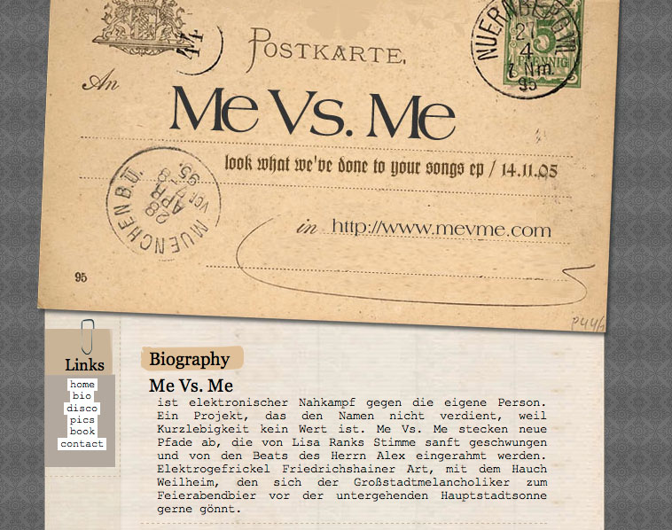
Here, just found that. The text doesn’t look too bad but its far away from being pretty either. The design of this page is made with some references to the analogue world, you know, a postcard, a paper clip and the font that is supposed to look like it was written with a typewriter. Of course it is not written with a typewriter, because it is the web and a typewriter wouldn’t let you write justified text.
[Update 3]
Yummy – so bad I had to update this post
Links:
- Wikipedia > Justified Text
- The CSS2 Text Properties
- The Creator of the Kubrick Theme
- The worst of the worst
- we-make-money-not-art.com
- everything.kiffer.de
- Maha’s Blog
Technorati Tags:
web, typography,webdesign, fonts
Good article. I examined this subject in “one of my Essays”:http://praegnanz.de/essays/typo-im-web-bitte-abstand-halten and came to the same result: Never ever use justified text on websites.
Ja, du hast Recht und ich schäme mich. Ich habe es immer vor mir hergeschoben, mal am Design meines Blogs zu arbeiten und einfach die default-Einstellungen genommen. Jetzt habe ich schon mal den Blocksatz ausgeschaltet. Irgendwann kommt dann noch mehr!
Toller Beitrag. Hier meine Gedanken:
There is only one thing that needs to be changed and which can be changed pretty easily. What I’m talking about is »Justified Text on Webpages« and I tell you why I think it needs to be banned from the web.
I think ther are some others: font size, tracking, line lenght, line spacing … by the way all these parameters are very well balanced in your text. It is wonderfull to read (especially for my 50 years old eyes)
… can produce large and ugly gaps between the words
Especially if you are writing in German or Finnish … because these are not languages but modular systems 😉 …. »Digitalkompaktkamera«, »Räävigeinninnenkäääsur« … And there is no hyphenation in the whole wide world web.
If you think »Hey, this guy is right, but how can I change it?«
You are absolutely right. I would immediately extend your recommendation on 90 % of justified printed matter too. Why the hell justified text?
js